
Whether you realize it or not, brands are a major part of our daily lives. From the coffee you drink to the clothes you wear, brands influence our choices and decisions, often becoming extensions of our identity. If you’ve read our previous article, “Crafting a Compelling Brand Persona: Why It’s Essential for Your Business,” you know that customers seek meaningful relationships from the brands they buy and that brand personas play an important role in deepening these connections. What you may not know is that businesses must first develop a comprehensive brand style guide to lay the foundation for creating powerful brand personas and meaningful customer connections.
In part one of this series, we explore the meaning of a brand style guide, its importance for businesses, and the first two elements to include in your document.
What Is a Brand Style Guide?
A brand style guide is a living document which explains how a business’s visual and verbal brand elements should be used by internal and external members. Its main purpose is to strengthen a company’s brand identity, ensuring all communications and content consistently adhere to the same standards. Although every business and industry is unique, brand style guides typically include one or more of the following sections:
- Logo Usage
- Colour Palette
- Typography
- Imagery
- Tone of Voice
- Brand Story

Why Is It Important for Your Business to Have One?
Although there are many advantages to implementing a brand style guide, these are among the top 5 reasons why it’s essential for businesses:
- Brand Consistency — It ensures that all content produced looks and feels like it belongs to the same brand, building reliability and trust among customers.
- Professionalism and Credibility — A well-crafted brand style guide helps organizations maintain a balanced professional image, enhancing their reputation as credible and trustworthy leaders in their industry.
- Streamlined Processes — Clearly defined guidelines save time and reduce confusion, making it easier for designers and marketers to create materials that align with the brand.
- Enhanced Brand Recognition — The consistent use of brand elements helps customers recognize and remember businesses more easily, which is essential to stand out in today’s crowded marketplace.
- Improved Adaptability — Detailed brand style guides support organizational growth and transformation, making it easier to adopt new platforms, mediums, and channels.

What Should You Include in Your Brand Style Guide?
Let’s explore the first two elements you should include in your brand style guide.
1 | Logo
While your logo might seem like a minor part of your business, its value is significant. As the primary customer-facing symbol and often one of the first points of contact, your logo plays a key role in shaping clients’ initial impressions of your brand. Therefore, it’s essential that internal and external stakeholders, use it to communicate a consistent and accurate representation of your business.
To achieve this, we recommend including the following details in your brand style guide:
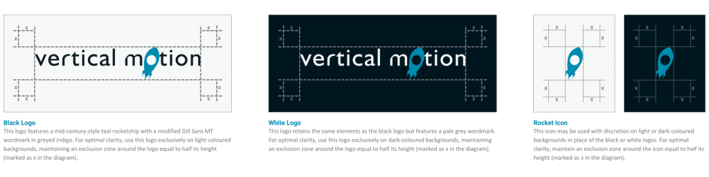
- Images of all brand logos and their variations (e.g., black logo, white logo, and rocket icon)
- Descriptions of the design elements for each logo (e.g., this logo features a mid-century-style teal rocket ship with a modified Gill Sans MT wordmark in greyed indigo).
- Instructions for logo usage (e.g., for optimal clarity, use this logo only on light-coloured backgrounds, maintaining an exclusion zone around the logo equal to half its height – marked as x in the diagram).
Though this is a great starting point for many businesses, we also recommend including examples of logo misuse. In doing so, you help further educate stakeholders on the acceptable use of your logos and significantly minimize the risk of errors. Key misuses to highlight include:
- Altering colours
- Editing transparency
- Rearranging elements
- Placing logos on busy backgrounds
- Recreating icons and wordmarks
- Applying visual effects
- Cropping logos
- Rotating, distorting, or skewing
- Adding extra elements
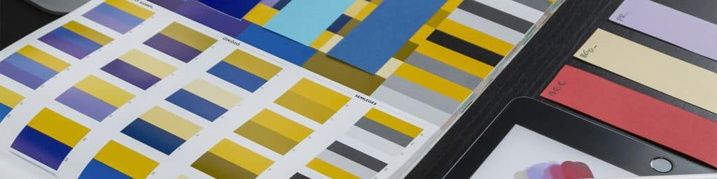
2 | Colour Palette
Another major component of a brand is its colour palette. Even without seeing their logo, we often recognize brands by their colours. Think of Coca-Cola’s red, Tiffany & Co.’s robin’s-egg blue, and Snapchat’s yellow, black, and white. Now imagine if Coca-Cola switched its cans to purple or Tiffany & Co. adopted orange—it would feel off-brand wouldn’t it? Just as these iconic brands maintain consistency with their colours, so should yours. Whether you’re designing a website, event swag, business cards, or slide decks, your colour palette should guide your design choices.
When it comes to documenting your colour palette, keep these points in mind:
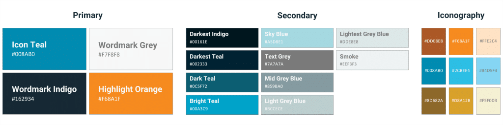
Primary Colours — These are the main colours that define your brand’s visual identity and should be used most frequently. Limit yourself to 1-4 primary colours to avoid diluting your brand image.
Secondary Colours — These colours complement the primary colours, offering depth, variety, and visual balance to enhance design while remaining on brand. Typically, secondary colours are used for backgrounds, borders, buttons, links, and different sections on websites and applications.
Purpose-Specific Colours — Some brands include an additional section in their colour palette for colours with specific roles, such as for accents or icons. Used sparingly, these colours stand out, drawing attention to important elements or calls to action.
Colour Codes — Always include the specific colour codes in your brand style guide to ensure consistency across all media. The most commonly listed codes are HEX but some brands also include RBG, CMYK, and occasionally Pantone.
• • •
In this article, we’ve defined the meaning of a brand style guide, highlighted the five benefits for businesses, and explored the best practices for establishing logo and colour palette guidelines. While these are important steps in our journey together, there is still a lot for us to unpack. Stay tuned for part two to learn more about the essential elements for developing an effective brand style guide.
Vertical Motion is a trusted Canadian software development and entrepreneur assistance company that has supported the global efforts of startups, non-profits, B2B, and B2C businesses since 2006. With headquarters in Calgary and Kelowna, and team members coast to coast, Vertical Motion is recognized as an award-winning leader in the technology industry. Our team of executive advisors, project managers, software developers, business analysts, marketing specialists, and graphic designers have extensive experience in several industries including — Energy, Finance, Blockchain, Real Estate, Health Care, Clean Technology, Clothing & Apparel, Sports & Recreation, Software as a Service (SaaS), and Augmented & Virtual Reality (AR/VR).
Come chat with us and let us take you “From Idea to Execution and Beyond!” 🚀