
As Calgary and Kelowna mobile app developers, we’ve seen a profound transformation in users’ needs, wants, and expectations over the past decade regarding mobile apps. What was once merely an on-the-go extension of computer technology has since evolved into an indispensable technological tool in its own right. As a result, users have come to expect businesses to deliver not only robust and powerful solutions but also seamless user experiences (UX).
Nevertheless, this rapid evolution of smartphone technology, coupled with a diverse range of user preferences, has presented businesses with the complex challenge of fulfilling user needs effectively. Without sufficient experience in mobile app UX, it can leave organizations with overwhelming uncertainty about where to begin and how to confidently allocate resources.
To assist you in overcoming this hurdle, this article explores three key principles of mobile app UX design that you should consider when developing a mobile app. While this list is not exhaustive, these principles serve as an essential starting point to help you craft a meaningful user experience to delight your customers.
1 | Mobile App UX Design Principle: Optimize Applications for User Comfort and Thumb Accessibility
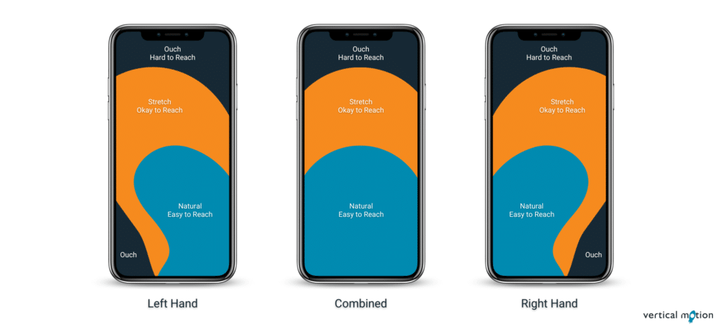
Smartphone users utilize various grips when holding their devices depending on their device dimensions, individual needs, and varying contexts. While this diversity exists, users generally adopt three fundamental smartphone holding positions: left hand, right hand, and combined. However, as smartphone devices have grown in size over the last several years, users have faced increasing difficulties in comfortably accessing the entire screen with their thumbs; this has placed a greater responsibility on mobile app UX designers like Vertical Motion to develop applications that account for these limitations. As demonstrated in the illustration above, smartphone devices are separated into three sections:
Natural | Easy to Reach — This section refers to the most easily accessible location on the smartphone screen and is reserved for elements that users interact with most frequently. On Instagram, for example, this area is where users scroll through content and interact with posts.
Stretch | Okay to Reach — This area refers to an accessible but less comfortable region on the smartphone screen and is reserved for elements that users engage with less frequently. For Instagram, this is where they showcase Instagram Stories, making it easy for users to explore recent posts and view content from all the accounts they follow with one easy click.
Ouch | Hard to Reach — This location refers to the most difficult region to access on the smartphone screen and is reserved for elements that users engage with least. On Instagram, it’s where users access settings and privacy information via the hamburger menu.
When designing your mobile app, be careful to consider these three areas and ensure your design aligns with user comfort and thumb accessibility.
2 | Mobile App UX Design Principle: Enhance Applications through Finger Friendly Buttons and Touchpoints
Mobile app UX design is more than simply organizing content to optimize user comfort and thumb accessibility. Another crucial aspect that must be considered when designing mobile apps is how users will interact with content, buttons, and other touchpoints on their screens. Poorly designed layouts can leave even the most tech-savvy greatly frustrated and lead to users abandoning your mobile app in favour of your competition. To avoid this, consider these three factors when designing your mobile application:
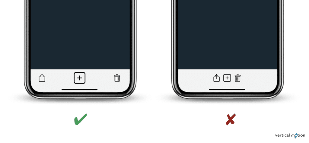
Comfortable Tap Targets — As a general rule, tap targets should be large enough that users can comfortably interact with them but not so large that they interfere with other content on the screen. Apple recommends a minimum tap region of 44 x 44 pt, while Android suggests 48 x 48 dp for their devices.
Prominent Primary Action Buttons — Elevate the visibility and size of primary actions such as “Save”, “Submit”, and “Confirm” to make them more prominent than secondary or tertiary actions.
Spacing between Buttons — To prevent accidental taps on neighbouring buttons, it’s important to maintain sufficient button spacing. It’s recommended to space buttons by a minimum of 8-10 pixels for proper separation.
3 | Mobile App UX Design Principle: Elevate Application Accessibility with Improved Readability
The final mobile app UX design principle we want to emphasize is the importance of prioritizing readability. Readability refers to a user’s ability to perceive, comprehend, and engage with information effectively within a mobile app. However, mobile app readability isn’t determined by one single element; it relies on several factors, including typography, spacing, padding, and colour contrast. These characteristics collectively shape the readability of a mobile app, significantly influencing user satisfaction, retention, and engagement. To elevate the user experience and ensure a consistently high level of mobile app readability, it’s important to carefully consider these six factors:
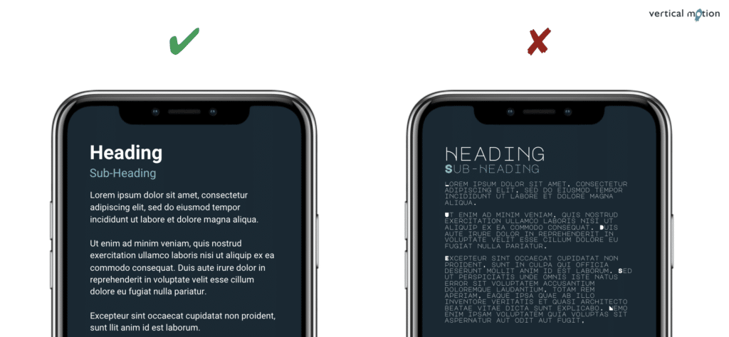
Font Size — For comfortable reading, it’s recommended that body text be set between 16 and 18 pts.
Font Selection — Use caution when incorporating custom fonts; instead, contemplate using OS-specific fonts like San Francisco for iOS or Roboto for Android to maintain visual consistency across platforms.
Headings — Establish a clear hierarchy for headings by employing variations in font weight (bold) and style (italic) and adjusting font sizes to distinguish between different heading levels.
Spacing — Be aware of content spacing, including leading (line spacing), tracking (letter spacing), and kerning (space between individual characters) to ensure readability and aesthetics.
Typeface Variations — Limit the usage of typefaces to a maximum of two—one for headings and another for body text to maintain consistency and enhance cohesion.
Negative Space — Leverage negative space to break up text and prevent screen clutter. Negative space can contribute to a cleaner, more visually pleasing design that enhances content readability.
• • •
As smartphone technology and user expectations have advanced over the past decade, it has become increasingly challenging for businesses to deliver both robust technical solutions and seamless user experiences. That being said, by prioritizing the three principles discussed above — thumb accessibility, buttons and touchpoints, and readability — organizations can begin creating a meaningful user experience for their customers.
Don’t let uncertainty about mobile app UX design hold you back from delivering innovative software solutions to your customers. Connect with our award-winning Calgary and Kelowna mobile app development team today and discover how to transform your mobile app from idea to execution and beyond!
Vertical Motion is a trusted Canadian software development and entrepreneur assistance company that has supported the global efforts of startups, non-profits, B2B, and B2C businesses since 2006. With headquarters in Calgary and Kelowna, and team members coast to coast, Vertical Motion is recognized as an award-winning leader in the technology industry. Our team of executive advisors, project managers, software developers, business analysts, marketing specialists, and graphic designers have extensive experience in several industries including — Energy, Finance, Blockchain, Real Estate, Health Care, Clean Technology, Clothing & Apparel, Sports & Recreation, Software as a Service (SaaS), and Augmented & Virtual Reality (AR/VR).
Come chat with us and let us take you “From Idea to Execution and Beyond!” 🚀